
The borders of commerce: Part 1
by The Frame Blog
How artists and curators began to abandon the ornamental giltwood frame, and how it found new ways to flourish…
By the mid-20th century, the picture frame as it had existed for around 600 years seemed to be in retreat; or, rather, many artists had retreated from the idea of an ornamental boundary which separated their work from the wall on which it hung, and from the possibility that anything might encroach on or detract from the painted surface of their canvas:
‘It’s intolerable to be stopped by a frame’s edge’, Clyfford Still, exh. cat., San Francisco Museum of Modern Art, 1976, p.123.
This trend towards a minimal style of setting had begun as early as the 1870s. The Impressionists, in choosing to reject ornamental gilded mouldings for plain painted – and, more especially, white – frames, had had a great influence on the avant-garde frames of the late 19th and early 20th centuries [1].
 Edgar Degas, Dancer au repos, 1879, in Degas’s own frame: this has now been removed: see below
Degas’s Danseuse au repos, as shown above in its original, artist-designed frame, had the distinction of retaining for more than 120 years the only original finish for one of his ‘pipe-shaped’ fluted frames. It was covered in polished gesso, giving an effect like softly-glowing ivory. Other frames with this profile have been gilded over by subsequent owners who did not appreciate the subtlety of Degas’s vision. Its radical modernity in the 1870s was a catalyst for many of the geometric mouldings and white finishes of the late 19th and early 20th centuries.

Gluck (Hannah Gluckstein), A Cornish farmhouse, c.1926, Liss Fine Art, in its stepped & white-painted ‘Gluck’ frame
There should, of course, be a caveat entered, that when the Impressionists had more money to spend on their art, they frequently chose to employ carved and gilded frames. But in general terms, as the nineteenth century continued to its end, profiles became progressively more simplified, and silver, gold & Dutch leaf lost in popularity to painted, stained or polished wood finishes.

John Piper, The forum, 1961, Tate; frame with canted linen-covered frieze & gilt top edge. Photo courtesy of a friend
During the 20th century other materials were also employed – fabric inserts and linings, which at one point seemed ubiquitous (and which for some reason were applied in the Tate Gallery to many of the frames on their collection of Turners); narrow mouldings of brushed aluminium; and slender lathes of deal which could be nailed onto the side of a stretcher, protecting it whilst remaining practically invisible.
Antique carved wooden frames generally retained their relevance for paintings of the same era, having also the cachet of their own antiquity; although where there was a disparity of period, some museums experimented with radically simplifying the frames in their collections:
‘William Rubin, Director of the Department of Painting and Sculpture [Museum of Modern Art, New York], is recorded as having described the gilt frames which formerly enclosed the superb series of works by Cézanne, Van Gogh, Gauguin, Seurat and others, as “eye-catching fluff”, and he has replaced them all with a limited range of simple narrow mouldings…[which] unleashed a well-informed howl of protest… Not withstanding the skills of the framer, Robert Kulicke, the starkness of those galleries does indeed strike an alien note… few visitors to MoMA today are able to accept [Rubin’s] description of the interiors as “neutral’.’
Editorial, International Journal of Museum Management & Curatorship, 1985, no.4, p.115.
Fortunately many decisions of this type were blocked or later reversed [2] – although sadly not fast enough to prevent irreplaceable losses in some cases: Jacob Simon reports stories of the rag-&-bone man, ‘Burner’ Bagnell, collecting antique frames in London in the 1950s and ’60s, whilst in York the curator of the City Art Gallery sold damaged frames to a similar collector; the fate in both cases for the frames was to be burnt, in order for the gold to be collected [3].

Edgar Degas, Danseuse au repos, 1879, pastel & gouache on paper. Sold at Sotheby’s 1999, at which point it still possessed its original, artist-designed, white gessoed frame
In ironic parenthesis, and in a strange reversal of this process, the Degas Danseuse au repos lost its original, artist-designed frame between its sale at Sotheby’s London in 1999, and at Sotheby’s New York on 3 November 2008.

Edgar Degas, Danseuse au repos, 1879, pastel & gouache on paper. Sold at Sotheby’s New York, 2008
It is an extremely sad state of affairs, when a collector – who has sat on the board of a prominent auctioneering company, and whose wife has presided over the board of trustees at an equally prominent museum – effects a divorce between the two parts of a work of art. Degas himself once discovered, when he went to dinner at their house, that some friends had removed the original frame from one of his paintings. He took the painting down from the wall, extracted the canvas from the new gold frame and walked out with it…[4]

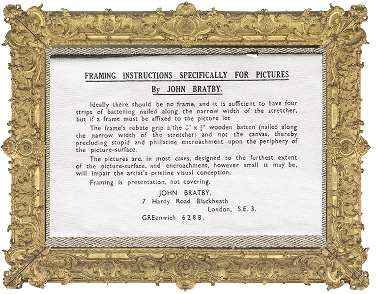
However, the question for museums bent on change more often concerned carved and gilded frames which were antique sculptures in their own right, and in no way justifiably alienable from their paintings. What few people wanted or cared about were the walls of ornate 19th century compo frames (as above), covered overall with aged, discoloured and brittle decoration which chipped and peeled away at the slightest disturbance. These were what gave the frame a bad name in the age of Le Corbusier and minimalism; and these probably helped to hasten the flight of the 20th century artist to the shadow box frame, the integral strip frame, or even to a complete absence of the frame – as demanded in John Bratby’s grumpily printed instructions at the head of this article.
But objects which exist for a long period, or exist in relation to another object, acquire a significance from their existence, or from that relationship, which can continue long after the original item or connection has vanished. The icon indicating a phone tends not to be a graphic mobile phone, but an outline of an old-fashioned receiver on a stand; icons of women show them in skirts, where the majority of women now wear trousers. The frame began to acquire this kind of life at an early period, and its significance as a border in other relationships than with paintings began to grow and broaden. Because it was connected with fine art, often with religious paintings or with portraits of the famous and powerful, the frame inherited a charisma by association. This made it the perfect vehicle to be adopted by commerce; and as – for instance – printing developed, graphic frames became the signifiers of respectable trades- and craftsmen, and of good-quality merchandise.

Trade card of John Cargill, Instrument-maker, 1739, Wellcome Library, London
Frames were used on the borders of trades cards almost from the moment these were produced: they were an easy way to create an impression of elegance, establishment and worth, and some of them are extremely beautiful. Whatever the disparity of the goods being sold (hardware, plans and surveys, or carpets) with the decorative qualities of the frames used to sell them, the purveyors of the goods would happily employ the most extravagant sculptural ornament in an effort to achieve a reassuringly trustworthy and upmarket image. From the 1740s, Rococo borders were particularly favoured. In this context, the frame was moving beyond its marriage with the painting, making an early alliance with commerce which continued to grow and flourish.

Trade card of George Farr, Grocer, 1750s; British Museum, Heal Collection 68.99AN930777
George Farr’s card is a model of Rococo design, with scalloped bands of rocailles, elongated airy scrolls, and little chinoiserie pavilions; the effect is to indicate that Mr Farr is an elegantly long way from the average High Street shop, and that his wares are imported from all over the globe. Where an actual Rococo trophy frame might have sculpted arms as attributive of the soldier’s portrait, this engraved frame has barrels of brandy, flagons of rum, chests of tea and pendant sugar loaves. The overall effect is of a gentleman who has unhappily fallen upon hard times, but who condescends to invite other selected gentlemen over his ancient and noble threshold to view the rare and edible treasures within [5].
It was only a matter of time before these paper advertisements took a more solid form. Shops had been advertising their goods for a very long time under the appropriate symbols: for example, a Roman sign from Pompeii makes very clear what was being offered. In London, from the Middle Ages onwards, you found the business you wanted by a physical three-dimensional piece of sculpture above the door; the gilded arm and hammer of George Whiley, goldbeater, is a late example dating from the 18th century, probably just before the introduction of numbered buildings began to make such rough-&-ready methods of signalling an address less useful. Further carved stone or wooden inset signs can be found on the Spitalfields Life website.
But the clarity of street numbers, although a far more functional device for directing shoppers (and postmen, when they were invented) to the right door in the right area, lacked the picturesque explanatoriness of an icon or sign. There was also the problem of literacy, or lack of it, in which the reading of numbers easily was probably also involved. Pictorial signs therefore continued to be used for commercial premises, both for shops and for inns, to supplement the geographical accuracy of street numbers – and many of them had frames.

William Hogarth, The march of the guards to Finchley, detail, c.1749-50, © Coram in the care of the Foundling Museum
The inn sign shown in the background of Hogarth’s The march of the guards to Finchley has Adam and Eve standing either side of a serpent-encircled tree, in a Mannerist frame with a carved hop flower hanging by the outer corner. This effectively tells the traveller that he has indeed reached an inn, serving beer, and that it’s called the Adam and Eve (in case he was looking for a different place). What could be clearer? And the frame lends the whole business a solid, reliable air, as though the sign were the Flemish altarpiece with which it has such clear connections[6].

Pieter Pourbus, Triptych with scenes from the Life of Christ, 1570, Groeningemuseum, Bruges. The frame is not original, but probably dates from the 17th century
Where better to find the frame of an inn sign than on an altarpiece in a church? Nothing disreputable could take place at an inn with a sign like that…

Sign of Ye Three Squirrels, mid-17th century, photo c. 1940. Courtesy of Barclays Group Archives
A different type of surviving commercial sign, apparently from the 17th century, is that of the three squirrels, which originally belonged to Mr Pinckney the goldsmith at 19 Fleet Street, London, where he was visited by Samuel Pepys [7]. The sign was passed on to Abraham Fowler, another goldsmith and also a banker, and then in the early 1740s to Goslings Bank. In 1896 Goslings amalgamated with Barclays Bank, which still has a branch at 19 Fleet Street, and the sign of the three squirrels is held in the bank archives[8]. It hangs in a metal spandrel frame, with scrolling tendrils, and an asymmetric cartouche decorates the sign itself. The asymmetry, along with the hint of a rocaille ornament at the top of this cartouche, indicates that the sign is 18th, rather than 17th century. The squirrels, presumably chosen for their burgher-like acquisitive and hoarding tendencies, were even more symbolic of a bank than a goldsmith; the cartouche lends them a slightly raffish air of gentility, as though they might have their crest or a founding date inscribed there. The spandrel frame, with its connection to oval portraits of the well-born and wealthy, reinforces this elevation of mercantile rodents. These are squirrels which a gentleman may trust.

Thomas Hosmer Shepherd (1793-1864), A row of shops on Holywell Street, 1853; © Trustees of the British Museum
In the watercolour, above, of a London street in the mid-19th century, we are in an area which had only recently, during the previous decade, clawed its way up to respectability on the back of the book trade. Holywell Street, off the Strand, had been a centre of ‘old clothes dealers’ [9], one of the surviving examples of which has been depicted prominently at the left of the painting.

Thomas Hosmer Shepherd, A row of shops on Holywell Street, detail
We can see how the flat shop sign on this façade has been presented in an eye-catching, ornamental frame – a more modern version of the old three-dimensional sign, which appears in the crescent moon further down the row. The frame is a simplified (possibly gilded) Rococo border which gives an unlikely cachet to the mundane text, and to the second-hand clothes dealer advertised on the fascia board – ‘Hawkers & the trade supplied’. The Watteauesque scene within the frame, of a woman admiring an 18th century paniered gown, is a similarly romantized version of reality; together shop sign and frame operate like the trade card of Mr Farr the Grocer, above, bestowing a very flattering elevation on I.T Wood and his old clothes-dealing.

Terra cotta commercial sign of John Bolding & Sons, founded 1822, Davies Street, London
Architectural frames were also co-opted into commercial signs; there is a splendid terra cotta example on the corner building between Davies Street and South Molton Lane, on what is now Grays Antiques Centre. This factory, the Grosvenor Works, was built in the 1880s for John Bolding & Sons, supplier of baths, lavatories and all their appurtenances to the great and good of the late 19th century – including Gladstone’s family home in Scotland.

Niche with Christ & St Thomas, replica of bronze statue, 1467-83, by Andrea del Verrocchio, Orsanmichele, Florence
Bolding’s sculptural sign is based on a Renaissance wall-hung 3-dimensional tabernacle, of the type which decorates the 14th century façade of Orsanmichele, Florence; or which was used to frame terra cotta and ceramic plaques of the Madonna and Child. It owes something to the contemporary fashion for Renaissance aedicular frames employed by artists such as Frederic, Lord Leighton, Lawrence Alma-Tadema, Edward Poynter, John Strudwick and Burne-Jones, as well as reinforcing the trend for Renaissance furnishings observed at the 1851 Great Exhibition [10]. Today we may view the use of a Renaissance niche for the frame of a sanitary ware manufacturer’s sign as bathetic, but during the second half of the 19th century, mediaeval and Renaissance architecture and applied arts were regarded as suitably celebratory in style for the industrial and technological innovations of the time. A full-scale example is the Abbey Mills pumping station, 1865-68, built by Sir Joseph Bazalgette as part of the construction of the London drainage system, and known as ‘the Cathedral of Sewage’. Bolding’s baths, showers and lavatories were innovatory, but they were also elegant and desirable, just like the spacious classicizing buildings of Renaissance Florence, and a classical tabernacle frame was therefore seen as perfectly appropriate to advertize the name of their creator and vendor.
*********************************
Part 2 of The borders of commerce will follow shortly
With thanks to the museums, galleries, the National Trust, and friends, who have allowed me to use images of their paintings
*********************************
[1] See Isabelle Cahn, Cadres de peintres, 1989, p. 65 ff.; and The Frame Blog: Antique frames on Impressionist paintings.
[2] See, for example, the ‘Thannhauser Frame Project’ at the Guggenheim in New York.
[3] Jacob Simon, The art of the picture frame, 1996, National Portrait Gallery, p.25.
[4] Ambroise Vollard, En écoutant Cézanne, Degas, Renoir, Paris, 1938, p.121.
[5] For trades cards, see the Waddesdon collection, the collection in the British Museum, the Spitalfields Life website (with 2 further posts on the same site), and a dissertation, The art of advertising…, Philippa Hubbard, 2009, University of Warwick.
[6] For this and further old inn signs, see Fritz August Gottfried Endell, Old tavern signs, 1916.
[7] Arthur Grimwade, London goldsmiths, 1697-1837, 1976, p. 16: ‘On 1 December 1660 Mr Pepys speaks of “calling upon Mr Pinckney, the goldsmith, he took us to the tavern and there gave us a pint of wine.” ’
[8] See Jessie Campbell, Barclays Bank Archives.
[9] George Reynolds, The mysteries of London, 1844-46, under ‘Holywell Street’.
[10] Noted by R. Wornum in his review of the Great Exhibition: quoted in Edward Joy, English furniture 1800-1851, p.153.

I have a feeling the original Degas frame is concealed under the gilt frame. The original had a reeded border, which is obscured in the second photo by a plain wood frame. In the third photo a white inner frame is visible. Is it possible that the addition of the plain wood frame has enabled the original frame to be slotted into the new frame? Just a guess, as I don’t know whether Sotheby’s regularly make outer frames for their lots.
Terry Roberts
LikeLike
Hi, Terry –
It’s a nice idea, but sadly I don’t think that it’s possible. The second photo is just a bad, lo-res picture of the original reeded and gessoed frame, and the third photo shows that the white slip at the sight edge has a large bevel – very different from the edge of the white frame. Also, there wouldn’t be room to cover one frame with another, without the top frame pushing far forward of the surface of the painting. I’m afraid that the white frame has definitely been taken off; whether it was included in the sale of the painting (one hopes), sold separately or discarded, I don’t think there’s much chance of it being reunited with the painting…
Lynn
LikeLike
Hi Lynn
Shame! I found another version of the 1999 photo at a slightly higher res- the grain pattern can be distinguished in the supporting easel- and it still looks like a plain wooden surround. However other photos of the present frame show the inside slip in a gold colour! Next step- non-reflective glass, with a clear bit in the lower right corner so the signature can be seen distinctly.
Terry
LikeLike
Great Caesar’s Ghost! I first saw Degas’ white frame in Eva Mendgen’s book, In Perfect Harmony. Last year I took an unfinished carved frame on tour that I had prepared “In the white” but hadn’t yet gilded. Looking all clean and cool in the polished gesso, I didn’t imagine so many patrons would comment about how much they liked the look of it and that I should probably leave it white and not gild it at all! Well, I did gild it and it looks splendid. But that experience and your post here about the Degas frame disaster has me questioning; to gild or not to gild?
I love your blog. WOOHOO!
Yours truly, Barrie Lynn Bryant
LikeLike
I think that polished gesso looks really good as a finish – and still quite avant-garde. It’s a very refined and clean look. Such a shame that this one remaining Degas frame has been taken off the painting; I can only hope that they’ve kept it, and have sold it along with the reframed work. Not to would be such an act of vandalism…
LikeLike
I so love finding this blog! I couldn’t agree more. In my mind, the frame is the border between viewer and artist; the proscenium arch through which one proceeds from our quotidian reality into the proposed artifice of the art. The big mistake the modernists made was in believing that they were somehow able to directly describe reality (in itself a total artifice!) without any separation from our subjective state. Always interests me to see that the most successful Abstract Expressionist painters were those who created the most space within their views: Pollock, Still, Rothko, etc, can all be seen as creating nothing more than empty stage settings for the mind to wander. Strange that they would reject the proscenium as a signal that that was the intention. I guess it’s a factor of the art museum setting they assumed their work would go into (eventually) where that is the assumed occupation of all who attend. Sorry, this is a bit rambling, but it’s Friday afternoon and I’m procrastinating trying to finish up a bit of painting!
In any case- thanks for the post and I am now a devoted reader!
LikeLike
Thank you for such a nice message; I’m so glad that you’ve found the blog and are enjoying it. Coincidentally, one of Seurat’s friends described him as using his frames like a proscenium arch – both for things like the Circus and the interiors, and for the landscapes. I think that part of the thing in the 20th century was the elevation of the canvas itself into a sort of fetishized object, rather than just the image on the canvas; so artists painted right up to (and/or) over the edge of the support, and that became the whole of their vision and had to be completely visible. There seems no other way to explain, for instance, Bratby’s antagonism to frames, in the wonderfully pompous label at the head of the post. It’s interesting that most people still choose to frame nearly everything, including photos and posters, when it’s for a domestic setting.
I have found your website, by the way, and am completely charmed; I love the idea of Pompeiian murals with skateboarders, etc….
Lynn
LikeLike